DESIGN INFORMATION

Design Information

Designers have a unique opportunity to enrich their work by encorporating the Irish language into it, whether in brochures, company stationery or packaging.

Designers within a company can incorporate the language into the company brand across the board, using the language to create a point of difference, to enhance the authenticity of an Irish product or brand, or simply to give the company the competitive edge they are looking for. See our section on ‘Gaeilge sa Ghnó for the benefits of using Irish in business.

Typefaces

Each language has its own characteristics and peculiarities when it appears in print. These include accents and other characters, letter frequencies, letter combinations and word lengths. Different typefaces and fonts have been devised to accommodate the characteristics of specific languages.

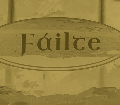
Irish can be written in a modern adaptation of the ‘bunchló’, the old-Irish script, or in the same typefaces as English. Companies and designers may wish to choose the traditional script or the English script, depending on the context and the image and brand sought after.

How to get the ‘fada’ on Microsoft Office

To insert the fada on a vowel, follow these directions:

  • After opening Word click on Insert and then on Symbol;
  • Choose (normal text) as font and Latin 1 as subset;
  • Click on the relevant letter and then on insert;

It is possible to assign shortcut keys (eg Alt and vowel for the fada) for these letters by clicking on Shortcut Key. These characters, if they are included in text intended for websites which is prepared in Word 8 and then saved as HTML, will appear as they should when viewed in Microsoft Internet Explorer Version4 for these letters by clicking on Shortcut Key. These characters, if they are included in text intended for websites which is prepared in Word 8 and then saved as HTML, will appear as they should when viewed in Microsoft Internet Explorer Version4.

How to get the ‘fada’ on an Apple Mac

To get the fada on an Apple Mac, select the Option key at the same time as the key e, followed by the vowel that needs the fada. For example: selecting Option together with e, and then the letter a = á… and so on with the other vowels.

If you need a capital letter with a fada, follow the same sequence along with pressing the Shift key. For example: selecting Option together with e, and then Shift together with a = Á… and so on with the other vowels.

How to get a fada on a smartphone
To get a fada on a smartphone, simply keep your finger pressed on the vowel you need to use a fada with. Your phone will display the extended keyboard, which gives you lots of options to choose from.

Layout

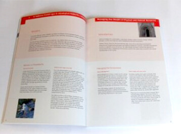
There is a number of standard layouts for bilingual text. Some formats are more appropriate than others; this will usually depend on circumstances and the nature of the material. Here are some of the key strengths and weaknesses of each format:


Parallel Columns

The two language versions are presented side by side in parallel columns. The choice of this option will obviously depend on the space available. Both versions will need to be of similar length. It is economic in terms of the space used as images only need to be printed once. The spine, cover, title page, contents, references and indices will need to be in both languages.


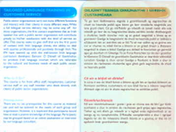
Parallel Pages

The two languages versions are presented side by side on parallel pages. Both versions will need to be of similar length, and facing pages may bear the same page number. Illustrations can again be shared between the two versions. The spine, cover, title page, contents, references and indices will need to be in both languages. This format is most appropriate when the reader needs to refer to the text in both languages, for example in publications aimed primarily at learners or households where both Irish and English are spoken.


Block by Block

For every block in one language there will be a corresponding block in the other. This is usually only appropriate where the text is composed of small units, such as captions for illustrations or short descriptions.


Top and Bottom

The page is divided into two halves, usually horizontally. This layout makes either language particularly accessible when a document is read on screen, as the user can scroll across and stay within their own language.


Back to Back

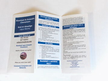
The two languages are printed back to back on the same sheet/s. This is particularly appropriate for letters and shorter documents. It is also favoured by some organisations for longer publications Pages may bear the same page numbers on both sides. You should be aware that stapling documents in this format can make the text on the left-hand page difficult to access. This format is also appropriate for concertina-folded leaflets, as the text can be read without interruption in either version and each language version may have a separate cover, with each leaflet usually containing an odd number of pages or panels.


Tilt and Turn

This gives two separate language versions inverted and bound together back to back. If there is a spine both languages need to appear on it. An advantage of this format is that text can be read with interruptions in either version. The same illustrations may be used for both language versions. This format does not easily lend itself to including pocketed information in the cover. Also, if this publication needs to be put on display it will need to be done in a way that will make it clear that it is a bilingual publication, as there will be one cover in each language.


Consecutive

The two complete language versions appear one after the other. This format is rarely used for bilingual publications.


Language Equality & Separation

Ensuring that both languages are separated and easily identified is more critical if certain formats are chosen: block by block, parallel columns, or top and bottom. It is very important that the languages are not mixed in an inconsistent or haphazard way, and that they are given equality in size, clarity and legibility.


Ways of differentiating languages include:

  • Adopting different colours for the text in each language, or for the background of each language.
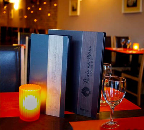
  • Choosing a different typeface for each language. However care must be taken that both languages are given equal treatment in terms of legibility.


Gaillimh le Gaeilge wish to acknowledge the help and guidance of the Welsh Language Board regarding this area of our site. www.bwrdd-yr-iaith.org.uk

Websites

Your website is an increasingly important portal and a great and easy place to show off your bilingualism! Whether you go for a fully bilingual website, or incorporate Irish onto some of your headings and text, we recommend that both languages are visible on most pages so that those viewing the English will get a sense of the bilingualism, and vice versa.


Samples of bilingual websites with differing levels of bilingualism:

Gaeilge sa Ghnó

The "Irish in Business" Service is designed to give companies a service in which they are guided through the process of adapting some or all of their business to bilingualism.

Find out more